Ever rushed to buy something with a limited offer just because it's ending soon? Hope your experiences were only satisfying. Regardless, we all have those moments once in a while when our brains are simply captivated by the allure of time-limited offers.
It's just how we're wired. We can't stand missing out. Sometimes I spare my sleep just to grab those "once-in-a-lifetime" deals (they feel like it).
And guess what? Your app users feel the same. While every app and user might differ, when you play the scarcity card right, your revenue can see a nice jump.
At Purchasely, we've watched this strategy work for various apps and helped them tweak it along the way. As we did, some key questions popped up.
Read on to find out the answers!
Scroll Guide
Why do time-limited offers work so well, you ask?
Limited-time offers are essentially time-bound promotional deals with clear end dates, which are often delivered as discounts, free trials, or extensions over a certain timeframe.
So why do these offers capture our attention and, more importantly, our wallets? "Doesn't everyone just want to save money?” But dig deeper, and you'll see it's not just about the money. It’s the deep-rooted psychological phenomena they tap into.
-
The illusion of scarcity: We are often swayed by scarcity. When we perceive something is limited, our desire for it just amplifies. Time-limited offers create a perception of scarcity, leading to higher-value placement by potential buyers.
-
The Fear of Missing Out (FOMO): It's that nagging sensation that we're being left out of the fun. When you know an offer has an expiration date, it gives rise to an immediate call to action, lest we miss out on the benefits.
-
The joy of exclusivity: Time-limited offers make users feel special, knowing they have something others might not.
When to drop those hot deals?
Now, where in the app user's journey do these offers shine the most?
-
Activation: New users are like explorers on a fresh adventure with their spiritual batteries full💪. But that initial plunge can still be intimidating. It's in these crucial moments that a well-placed, limited-time offer can feel like a warm invitation.
-
Retention: Once users become familiar with your app, there's a chance that curiosity for alternatives starts to drain that initial spirit 🪫. Perhaps by this point they simply don’t see the need to continue using the app. This is precisely why it's the perfect window to reintroduce that allure with a surprise offer, reminding them of the unique value you provide.
-
Upsell: Loyal users who've stuck around are often ready for more. They're even comfortable with the habit they’ve built. But comfort can lead to stagnation. A well-timed offer here can highlight higher-tier package features they've yet to explore.
-
Winback: For the ones that got away, sometimes, all it takes is a simple reminder of the good times 🔔. A tempting limited-time offer serves as that beacon, leading them back to what they once loved.
8 tips for crafting time-limited offers they can't refuse
Let's stir in some of that secret sauce to turn these offers into an “I need this now!”
1. Set the clock: Time-limited is time-sensitive. Avoid vague phrases like "For a limited time." Instead, shout out "24 hours only!" or "Deal ends this Sunday!"
2. VIP treatment: Everyone wants to feel like they're in the inner circle. Tailoring offers for target audience groups based on attributes like interests, intent, and demographics, elevates the time-limited offer from a mere deal to a powerful retention strategy.
3. Honest hype: If you have genuine and solid testimonials or reviews from happy users, show them off! Trust factor does matter and works everytime.
4. Pay attention to the copy: Behind every irresistible offer is a brilliant copywriter. The right turn of phrase, an engaging tagline, or a CTA can be the difference between a “close paywall” and a “subscribe”. So, give your words the weight they deserve.
Click here for some paywall copy optimization tips!
5. Test your offers: You think you have a killer offer. But is it the best it can be? A/B test. Check which variant resonates with your audience, tweak the copy, and see which offer type or rate works best.
Click here to learn more about A/B testing your paywalls without coding (over a coffee)
6. Sync with holidays: Consider aligning your limited-time paywall offers with other notable dates on the calendar, such as New Year's Day, Black Friday or Valentine's Day.
7. Keep the surprise factor: Overdoing it with frequent offers can dilute their allure. Users might not feel the butterflies to commit if they sense another deal is just around the corner anytime.
8. Amplify the urgency with a timer: Be transparent about the time left to unlock the special offer. Incorporating countdown timers has been proven to boost engagement. (More on this below)

Using a timer to amplify the urgency with Purchasely
Why do we love saying "drum roll, please!"? The answer lies in 'anticipation'. This same feeling arises with the ticking countdown on your paywall screen. With every tick, users are not just thinking about the offer, but feeling the rush to act on it.
If you're exploring ways to leverage that “urgency” factor, Purchasely Paywall Builder is worth considering.
Purchasely has transformed what might seem complex into a simple task.
Here's a quick rundown of its advantages:
-
Design flexibility: You can seamlessly integrate a timer regardless of the template or layout you're working with.
-
Absolute or relative: Relative timers reset every time they're viewed, but not the absolute timer. It provides a consistent countdown, maintaining its pace even if users revisit the paywall multiple times.
-
Straightforward setup: Implementing the timer is a straightforward process. Whether you opt for a countdown template or another design, the steps are intuitive.
Relative timer vs Absolute timer
Relative timer
-
Purpose: This timer resets every time users reopen the paywall, providing a consistent sense of urgency, regardless of when they view the deal.
-
Setup:
1. Choose the timer type as 'relative'.
2. Specify the countdown duration in seconds.
3. Select your preferred display format, whether it's days, hours, minutes, seconds, or any combination thereof.
Absolute timer
-
Purpose: Want to link your offer to a real-world event or date? This timer calculates for you, showing users the precise time remaining until a specific deadline.
-
Setup:
1. Choose the timer type as 'absolute'.
2. Input the target date and time, making sure to specify the time zone.
3. Again, customize how you'd like to present the countdown, from days all the way to seconds.
Time-limited offer examples built with Purchasely
Apps from different categories are using Purchasely's Paywall builder to integrate countdown timers into their offerings. Below, are some standout examples that showcase just how impactful and effective a well-placed timer can be.
Countdown and timer paywall examples
User journey stage 1: Activation & Retention
%20-1.png?width=736&height=485&name=Timer%20Paywall%20Examples%20(Activation%20%26%20Retention)%20-1.png)
1. Salams: Salams utilizes a classic short-term activation strategy. By offering a 40% discount on “Salams Gold” for one day and showcasing the reduced price, it's designed to spur immediate user engagement and drive quick conversions.
2. Ornikar: Ornikar's time-limited offer paywall employs a combination of effective strategies: a free trial, a transparent STEPS paywall layout (learn more here), and a time-limited promotion (the timer is hidden). Layering the Black Friday allure on top, their goal is clear: maximize the first user engagement!
3. RAYA: Activation is key for RAYA. With a daily deal highlighted by a timer, they're pushing for users to act quickly. Offering multiple subscription lengths also gives users flexibility, optimizing the likelihood of conversion.
4. Dua: Dua's paywall is designed for both activation and retention with a strong emphasis on clarity. The "SPECIAL 7 Days Premium Offer" immediately grabs the user's attention, but what stands out is the detailed listing of benefits such as "See Who Likes You," "Unblur all profiles," and "Send InstaChats." The timer adds urgency to the deal, while the clearly stated renewal terms aim for transparency.
User journey stage 2: Upsell
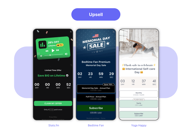
5. Stats.fm: Stats.fm’s "Lifetime offer" is a classic upsell. By emphasizing the long-term benefits and creating a sense of urgency with a timer, they aim to get users to opt for a higher-value package.
6. Bedtime Fan: Bedtime Fan uses a special offer that matches the Memorial Day mood. By adding a time limit and a good discount, they're aiming to get people to sign up for a longer time.
7. Yoga Happy: Yoga Happy's flash sale isn't just about slashing prices. It ties it with "International Self-care Day" to remind people what the health app is all about. It offers a deal that fits with the app's main goal.
User journey stage 3: Retention & Winback
.png?width=736&height=485&name=Timer%20Paywall%20Examples%20(Retention%20%20win-back).png)
9. Ducktoon: Ducktoon focuses on retention and win-back. The Black Friday theme with attractive deals is designed to keep current users engaged and to bring back previous ones.
10. Paris Match: Paris Match's digital subscription offer combines retention with win-back strategies. The themed promotion and listed features aim to keep current users while luring back those who may have moved on.
11. Kidslox: Kidslox emphasizes user safety to drive retention and win-back. By promoting parental controls and offering discounts for different subscription options, it aims to keep existing users and regain those who might have considered other options.
12. FitHer: FitHer's win-back strategy is clear and compelling. Using a persuasive re-engagement message, "We Miss You! Come Back and Crush Your Fitness Goals With A 50% Off Deal", the app emphasizes a limited-time offer. The dual options, "LIMITED TIME ONLY" and "Maybe Later", give users a clear choice, making it a well-rounded approach to regain user engagement.
.png)
.png)


%20-1.png?width=736&height=485&name=Timer%20Paywall%20Examples%20(Activation%20%26%20Retention)%20-1.png)

.png?width=736&height=485&name=Timer%20Paywall%20Examples%20(Retention%20%20win-back).png)


