User retention is the holy grail of app subscription businesses. Behind Purchasely’s new Paywall Template born to help businesses achieve exactly that, there was a big inspiration coming from Blinkist’s app transformation that led to some impressive impact on business KPIs. From human psychology to insightful statistics and real-world examples, this article looks at the story through the microscope, proposing a fresh perspective on how every product team should move forward.
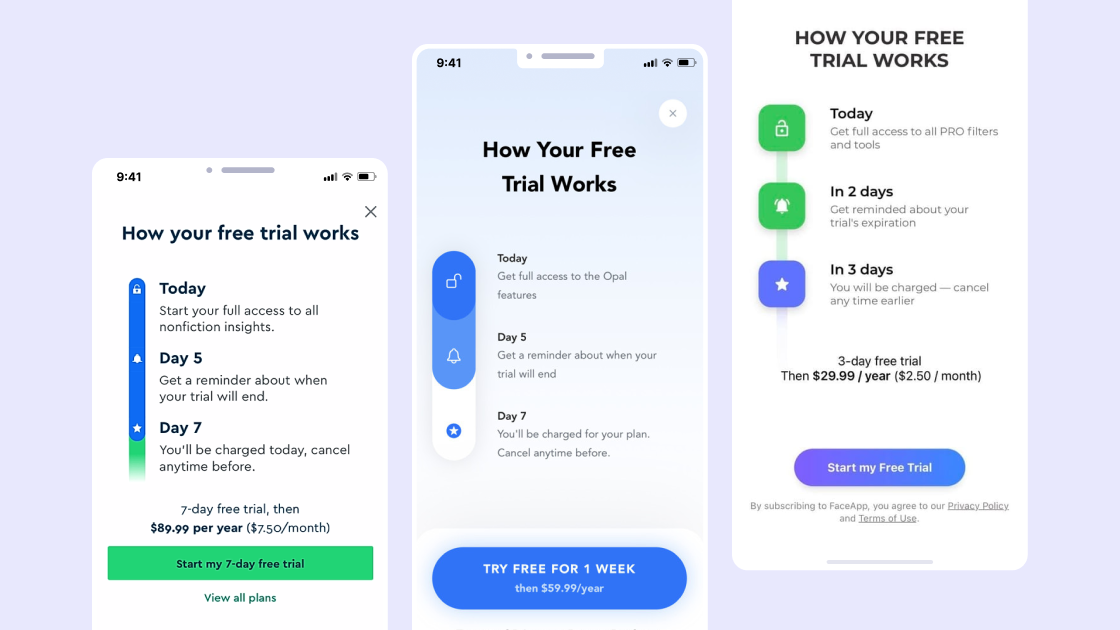
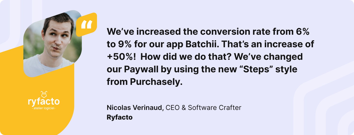
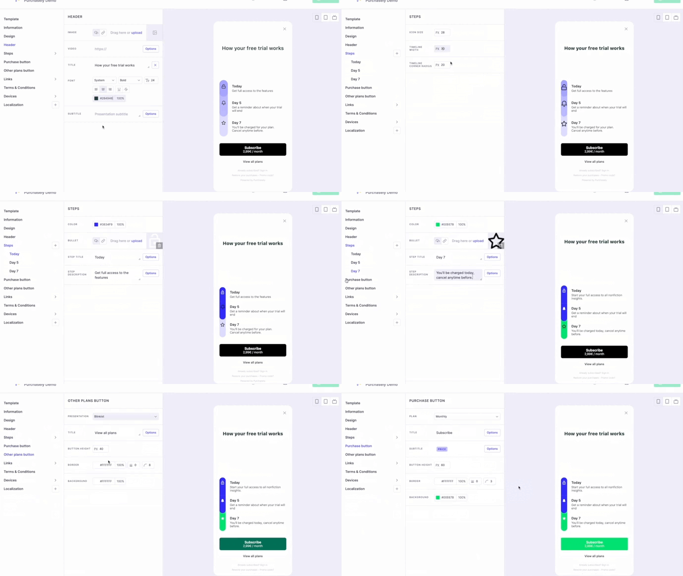
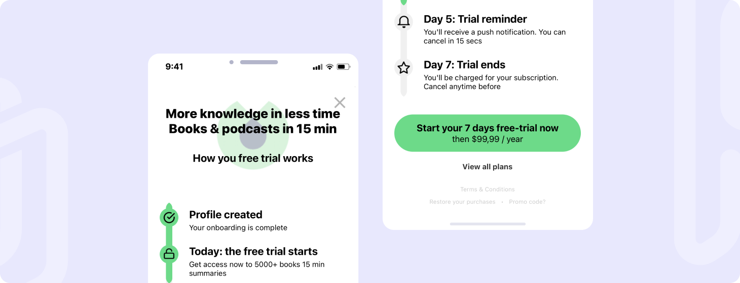
Purchasely has released a brand new Paywall Template in its Console called STEPS. This template is inspired by the Paywall firstly deployed at scale by Blinkist, a leading book summary service.

This simple paywall gives app businesses the privilege to:
-
increase the conversion to trial by 23%,
-
increase the conversion to paid by 4%,
-
increase the push notification opt-in from 6% to 74% (!!)
-
decrease the customer complaints by 55% (!!)
Source: How Solving Our Biggest Customer Complaint at Blinkist Led to a 23% Increase in Conversion
It is rare to see a product initiative having such a positive impact on so many KPIs. Let’s get our heads around why and how it is possible.

What happened to Blinkist?
Blinkist is the leading destination for lifelong learners. It is the perfect app for curious people who love to learn, busy people who don’t have time to read, and even those not into reading. It provides 15-minute audiobook summaries for nonfiction bestsellers and is used by more than 20 million users worldwide. Blinkist requires an In-App subscription to access premium content, which starts with a 7-days free trial.
In 2020, Blinkist team wanted to increase their customer satisfaction. The top complaint they were facing was coming from unhappy subscribers that had forgotten to cancel their subscription during the free trial.
They conducted very thorough user research and iterated for 6 weeks to better understand the issue and find a solution that works.
Looking at the problem through the microscope
Let's touch base on the 3 biggest subscription roadblocks before digging into the concrete problem.
-
For decades, companies have been using various dark patterns to retain their subscribers and complicate the unsubscription process: subscribing is very easy and frictionless, but canceling requires chasing after support service sometimes with delays. The asymmetry between the 2 processes can come off as a trap.
-
In-App subscription is still an emerging consumption model and many users do not fully understand how it works (when they will be charged, who will charge them, how to cancel).
-
Despite the app store platforms' verification efforts, scam apps still exist, charging very high prices without bringing the corresponding value to the users. There are not so many but we regularly hear about them, which creates an availability bias - the natural human tendency to rely disproportionately on the most immediate examples. Occasional stories about apps being banned after scamming users can cause such phenomena, inducing anxiety and affecting purchasing decisions.
A combination of these problems can hamper users' adoption of subscriptions even in mobile apps where cancellation can be made at any time directly from user device settings.
As a result, 2 very common user behavior patterns can be observed:
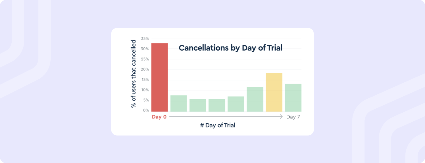
At Purchasely, we observed about one-third of new free trials get canceled during the first hour, then 40% get canceled during the first 24 hours. A typical pattern showed that users would start their free trial in the app, then immediately cancel the next renewal in their device setting to avoid any charges in case they would forget to cancel it later or are unsatisfied with the app offerings, rather re-opting in if they want to continue enjoying the free trial

Let's think about our thinking!
Such behavior patterns can be explained by digging into how our brains work. Daniel Kahneman suggested that our brain has two modes of thought:
-
System 1 - fast, instinctive, and emotional
-
System 2 - slower, but also much more logical and rational
As demonstrated by Kahneman, system 1 takes the driver’s seat in most of our day-to-day decision makings. The particularity of system 1 is that it is much more subject to biases and irrational aversion to fears and this has a strong impact on how we behave.
What kind of biases are we talking about?
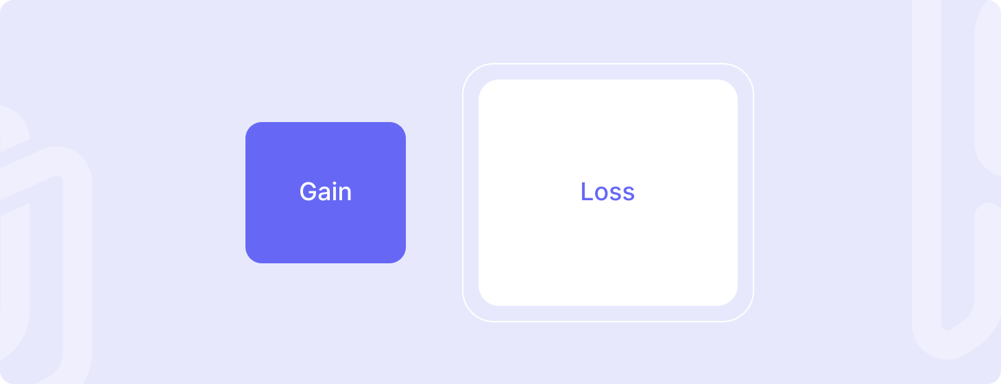
The loss aversion
Subscribing to a new service is a tradeoff between the value you will get from it and the money you will pay for it. If the perceived value, the gain, doesn't meet the expectation, then the money spent will be perceived as a loss.
Relying on various social experiments, Kahneman demonstrated that loss has a much greater emotional impact than gain, resulting in people’s tendency to avert it than to achieve gain.

Heuristics, mental shortcuts
A heuristics, a system 1 activity, is a mental shortcut that allows an individual to make a decision, pass judgment, or solve a problem quickly and with minimal mental effort. Heuristic thinking can be effective for making immediate judgments, however, they often result in irrational or inaccurate conclusions.
Let’s apply this concept to the user behavior pattern during the subscription process.
THE DECISION
THE HEURISTIC BIAS
-
-
The loss has naturally a bigger impact than potential gains, so users take the mental shortcut to focus instantly on the money they fear to lose than on the gains they expect, especially if the price is high.
-
Because of the dark patterns associated with subscription (the subscription trap), free trials trigger a warning in users' brains - if it’s free, there might be a trap. A subconscious mechanism affecting users’ rationality.
-
Brain System 1 automatically establishes references to examples that are more familiar and less uncertain when making new decisions. For example, when considering a new subscription, people often subconsciously compare the potential outcome to their experience with other trusted brands such as Netflix, Amazon Prime, or Spotify. If the new subscription has a similar price, an immediate question arises: “will I get the same value for the same price?”. Although, it’s a fair doubt.
THE OBSERVED BEHAVIOR
And this is how Blinkist responded to the human nature
Two words - clarity and transparency. Instead of being discreet about the transition between free to paid, which could evince scams and trigger anxiety, Blinkist brought the whole thing to light using(drum roll please…) push notifications.
Blinkist understood that clarity and transparency lay the foundations for a trusted and safe environment, reducing uncertainties and risks for the users.
-
In the short term, users can actually focus much more on the gains when the risk of loss is eliminated, allowing an “I have nothing to lose, so let’s give it a try” mindset.
-
The business impact of Blinkist’s effort in building trust with users may be difficult to evaluate in the short term, but in the long term, trust act as an essential ingredient for user loyalty to a brand, retention, and word-of-mouth reputation.
Other benefits of clarity and transparency
Many might intuitively think that sending push notifications to remind free subscribers that their paying subscription is about to start is like bringing bad news that drives people away.
But the truth is
- Transparency always pays: openness embeds trust, not doubt, in the customer journey which brings positive motivation to pursue business then negative motivation to avoid it.
- Transparent reminders also increase the push notification opt-in rate. Proof? After adopting transparency at the core of their user engagement tactic, Blinkist’s push opt-in sky-rocketed from 6% to 74%, which offered them a broad scope of new opportunities for onboarding their subscribers and achieving the main product activities that best show the value of the product.
- This is really to users’ own advantage - push notifications urge users to take full advantage of the free trial while they can. When sent at the right timing - for example, 2 days before the termination rather than on the last day of the free trial - last-minute reminders allow users more time to benefit from the free trial to assess the real value of the subscription.
When is this tactic useful?
Such reassurance flow is particularly relevant for innovative products (where the gain is quite difficult to assess prior to the free trial) such as self-improvement services. It can be particularly efficient for subscriptions with heavy prices or long-term commitments (eg: 6 months to 1 year). The lower the price, the lower the potential loss, so it does not make real sense if the subscription price is very low or the renewal periodicity is short (e.g.: 1 week to 1 month).
Finally, it will have a positive impact on the conversion to paid only, when the benefits of the subscription and the value of the product can actually be discovered during the trial period. So this means that onboarding the customer and engaging them with the product becomes even more critical to avoid impacting negatively the overall business with a poorer conversion to paid
How an “ideal” free trial looks like
It’s an open question. What’s for sure is that various lengths of the free trial should be tested but essentially, a longer trial period (i.e. more gratuity offered to the user) does not necessarily lead to a better conversion to paid.
Rather, the best way to convert from a free to a paid subscription is by helping them perfectly understand the benefits of the subscription and its continuous reward. How do we achieve that? It’s by engaging and telling the product story in a consistent, timely, and transparent(never too much to repeat) manner.
The app must take the free trial user by the hand and move forward together step by step. This should be done right when the intent is the strongest and the motivation is at its top. If the app lets the momentum slip away, motivation might fall and the user might lose the appetite forever.
Another thing to consider when deciding the length of the trial - a shorter trial period means that the new subscriber will have to take the new habit faster and more efficiently. Think about it this way: are you more likely to come down to a decision when you have plenty of time to consider, or when you are in an emergency? Remember our good old fast, instinctive, and emotional friend in the driver’s seat - brain system 1.
Could the Blinkist paywall be improved?
Yes, with triple exclamation marks. There’s always room for improvement in the world of app business. Our humble criticism of the Blinkist paywall is that it only focuses on the communication about the free trial. It actually misses out on suggesting the benefits of the subscription. It is of course very important as we’ve seen to reassure users and create a safe environment, but users will not commit to a longer subscription if they do not understand its benefits.
A fix for this could simply be adding some lines about subscription benefits matching the users' goals.
Finally, as suggested in the wonderful article by Growth.design, adopting the goal-gradient effect could also have an even further positive impact as it gives users a sense of gradual achievement and engagement in their journey to become loyal users.
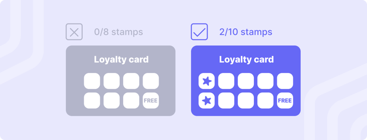
A tip from a popular experiment on this effect is that a 10-stamp loyalty card pre-stamped twice will be completed faster than a clean 8-stamp one with 0 pre-stamps as there’s a sense of reward from the get-go that feeds users motivation to continue the effort. Starting from scratch is always difficult for everybody.

The same rule applies to paywalls. Showing users that their journey already started on a springboard and reminding them that some of the mandatory formalities (in other words, some of the effort they will have to make for the best use of the app) are already behind them will likely increase their motivation to convert to paid users.

What principles should every product team adopt?
Here are some powerful lessons from the Blinkist’s story.
-
Recurring payments require loyalty, which grows from the trust in the brand. To build a successful app, product teams should always be transparent, ethical, and fair to their users: if it is easy to subscribe, it should be as easy to unsubscribe. The cancelation flow should then be accessible directly from the app. Very few apps are embedding it, whereas this is a way for the brand to show that it is worth being trusted, and it is also a unique opportunity to collect users' feedback prior to sending the user to the device’s settings. In any case, if subscribers really want to unsubscribe, they will find their way to the settings, so making it difficult is simply useless.
-
Blinkist product team did a super job on adopting their free trial reassurance, and this was not an accident. They conducted rigorous user research, interviews, and product methodology to understand the customers' pain points. Then they prototyped a solution based on user psychology. Understanding the customer journey, and mapping their pain points and goals at each stage is definitely the best way to improve the business!
References:
.png)
.png)
