Picture this (and this happened to me): You're snuggled up with your toddler, deep into a captivating children's story. You can see that each character brings a sparkle to your child's eyes. As you swipe to the next page to find out the story's next twist, there's a sudden stop: "To continue reading, please subscribe." You've come face to face with the digital cliffhanger known as the "paywall."

The rise and widespread adoption of paywalls make perfect sense. They serve as a means to drive revenue by placing premium or enhanced in-app experiences behind a purchase gateway.
However, there's a counter-narrative that's gaining traction and you might just be familiar with it too.
The very mechanism meant to support app growth has become a point of contention for many users. Rather than feeling like a golden key to exclusive content, paywalls sometimes come across as barriers, hindering the seamless digital journey users have grown accustomed to. Need evidence? A quick online search for "paywall" provides insight: numerous results focus on methods and workarounds to bypass these checkpoints. It's not just about users not wanting to part with their money. It's an indication of a broader sentiment: that paywalls, in their current form, often feel more like hurdles than gateways.
The puzzle that app developers and marketers now face is clear: how can they harness the benefits of paywalls while also crafting an inviting and smooth user experience?
Scroll guide!
Tips to stop the urge to bypass paywalls
Tip 1. Integrate an onboarding flow with your paywall
Integrating an onboarding flow with your paywall is similar to making a strong first impression on a first date.
The analogy of viewing the paywall as a first date is more fitting than it might seem. Consider this: first dates, in an ideal scenario, are filled with curiosity, tentative exploration, and a yearning for mutual understanding. By weaving the paywall experience into the onboarding flow, you're facilitating that ideal first-date scenario rather than a sales pitch. Put differently, with an onboarding experience, you are charming the users smoothly rather than making an awkwardly forward proposition.
So, you're convinced to introduce your users to a seamless paywall experience, but where do you begin? What should this onboarding journey encompass? The options are vast, but based on experience, hitting the following four targets can make a world of difference:
1. Foster two-way communication: Onboarding shouldn't be a one-sided affair. Instead of a monologue, make it a dialogue. Encourage users to share their objectives and gather information that allows you to generate valuable user data. This ensures you can provide a tailored, personalized experience right from the get-go. A common question arises: Should onboarding be extensive? Our advice? Balance is key.
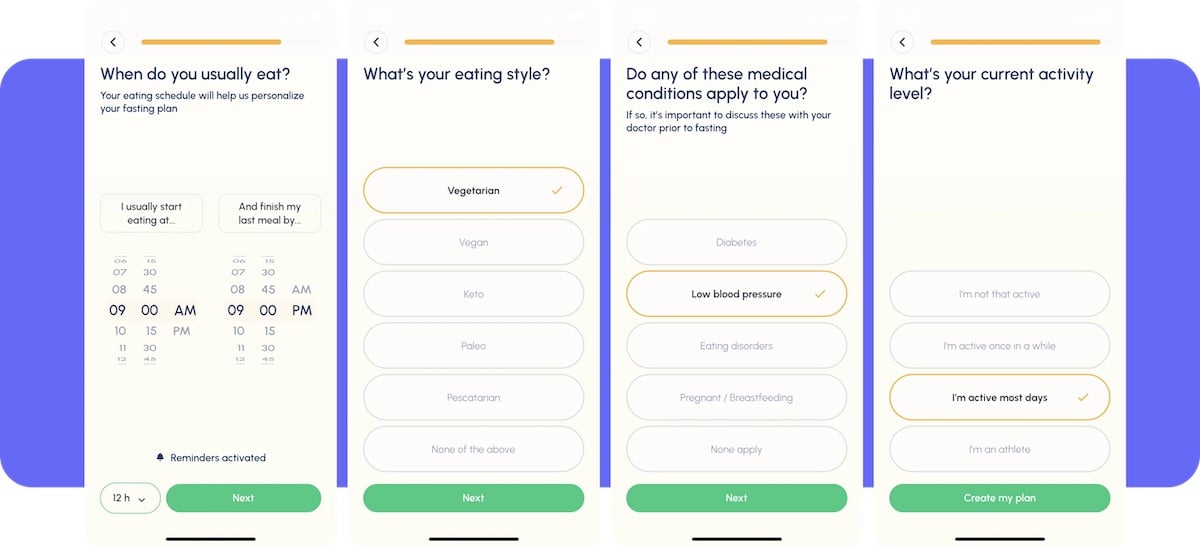
Fastic's onboarding involves around 15 to 20 screen-long questions. Listen to our conversation with Tobias Boerner, Co-founder of Fastic
2. Establish trust early on: Onboarding isn't just a tutorial; it's your chance to lay the groundwork for a trusting relationship. Present the core values of your platform and illustrate the distinct benefits that wow your users. Remember, the initial sessions after an app download are when user intent peaks. Captivating them with benefits early can be a game-changer.
3. Maximize onboarding engagement: Steve P. Young, founder of App Masters shares an illuminating stat: between 60-80% of users who make a purchase will do so during onboarding.
This statistic proves the importance of having an onboarding from the first place, then linking it with the first paywall at an early stage. As mentioned in our recent chat with Steve on the "Subscription League" podcast, one of his client's apps saw a staggering 234% increase in conversions simply by incorporating a paywall during onboarding.
4. Personalize that first paywall: The goal? Transition users from a smooth onboarding journey to their very first paywall without a hitch. The progression should feel natural, not forced. This means offering a paywall tailored to each user's context. Perhaps it's showcasing features or programs aligned with their expressed preferences during onboarding or suggesting the most fitting subscription plan.
Tip 2. Build a sense of belonging
Everyone wants to feel like they're part of something bigger. We naturally gravitate towards communities and platforms where we see reflections of ourselves or where we envision our ideal selves. Your paywalls can either act as an abrupt barrier or an inviting gateway to such a community.
The difference lies in how you present it!
Incorporating social components is the key. It's not just about the product or service you're offering; it's about the community that comes with it. When users witness other members sharing, engaging, and benefiting from your platform, they're less likely to want to bypass the screen and more inclined to join the community.
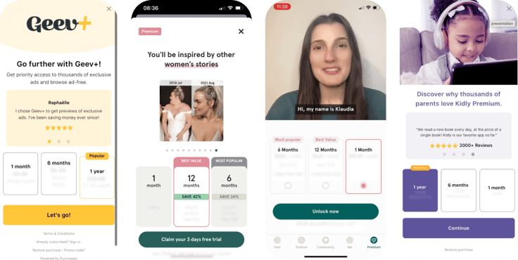
Examples of paywall social components (from left to right: Geev, Fastic x 2, Kidly)
Here's how you can leverage this psychological insight:
-
Video testimonials: A genuine video review or testimonial is worth a thousand words. Let your potential subscribers see and hear real stories from satisfied users. Their enthusiasm, the real-life benefits they've gained, and the genuine appreciation they have for your platform can be contagious.
-
Visual snippets of user-generated content: Display the best of what your community has to offer. Whether it's a beautifully crafted project, an insightful comment, or a transformative story, shine a light on the creativity and value generated within your platform. When potential subscribers see what current users are achieving and sharing, it reinforces the value of joining and staying.
Tip 3. Making irresistible offers: Beyond just discounts
Imagine standing at a store checkout, and just as you're pondering over a purchase, the cashier offers you a timely discount or an add-on. That little nudge can make all the difference between abandoning your cart and proceeding to payment. Digital paywalls aren't much different.
When a user is confronted with a decision at your app's paywall, they're silently asking: "Is this really worth my money?" Your answer shouldn't just be a simple 'yes'. It should be a resounding, "Abso-bloomin-lutely, and guess what? We have a special treat just for you!" Here's how you can make those offers truly irresistible:
-
Seasonal offers: Everything feels a tad more special during the holidays. Whether it's a Christmas surprise or a Black Friday bargain, timing your offers with popular events can give users the final push they need to subscribe. It creates a sense of urgency, making them feel like they're grabbing a limited-time deal.
-
First-time bonuses: Remember the joy of unboxing a toy and finding a little extra inside? Give your first-time subscribers that same delightful surprise. Extend their trial period, throw in some bonus content, or offer them any valuable extra to make them feel their decision to subscribe was absolutely right.
-
Loyalty rewards: For those who've stuck with you through thick and thin, a little acknowledgment can go a long way. Show your gratitude with unique offers, discounts, or content. Let them know you see them, value them, and that their commitment to your platform is truly appreciated.
Tip 4. Two-way communication: Making paywalls interactive
Imagine being pulled away from whatever you are doing to sit through a one-sided sales pitch. Not too thrilling, right? When we view the standard paywall experience in this light, it's clear that the approach could use some tweaking.
In the world of marketing, the magic of interactive content is already well-recognized. Below are some interactive marketing stats for 2023.
- 88% of marketers say interactive content helps brands differentiate themselves
- Interactive content generates 2x more conversions than passive content.
- 90% of consumers find interactive content more memorable than static content.
- Interactive content has a 70% completion rate, compared to 36% for non-interactive content.
Here's what the shift to the interactive paywall experience can offer:
-
Increased dwell time: Engaging users interactively can keep them on the paywall longer, giving them more time to consider and potentially make a purchase.
-
Reduced frustration: Allowing users to voice their concerns or feedback can alleviate potential points of friction they might feel when faced with a paywall.
-
Personalized user journey: By understanding user feedback and responses, you can guide them towards features or content that align with their interests or needs, making the paywall experience feel more tailored and less generic.
Tip 5. Talk about the users, not just the app
Humans just love listening to and telling stories. According to scientists, we evolved to do so based on two grounds: survival and status. Listening to stories teaches us how others solve problems, and telling stories allows us to make us look good. This somehow explains the recurring theme in most of our stories, you guess it, ourselves. As Scientific American points out:
Why, in a world full of ideas to discover, develop, and discuss, do people spend the majority of their time talking about themselves? Recent research suggests a simple explanation: because it feels good.
So, when it comes to engaging users at a paywall, why not tap into this human quirk?

Instead of bombarding users with details about monthly plans, discounts, or features straight away, try spotlighting their journey on your app first. You can link the transactional paywall screen with other screens that allow you to have the time and space to tell stories about users' experiences and achievements.
For instance:
-
Fitness apps can detail workout achievements, calories burnt, or milestones reached.
-
Reading platforms can highlight most read genres, average reading time, or books explored.
-
Music platforms can spotlight top genres, frequently played tracks, or even create personalized playlists.
-
Dating apps can notify users about the number of people viewing or liking their profile.
Telling stories about users' in-app journies in this manner is already a powerful engagement magnet. Taking it a step further creates the perfect opportunity to entice renewals, promote upsells, and reduce churn.
TL;DR? In a Nutshell:
Hitting paywalls can be quite the unwelcome twist in the user journey. The challenge for app marketers is to craft a seamless and enticing paywall experience. Here are key strategies shared in this article.
-
First impressions matter: Paywalls are like a first date. A smooth integration with onboarding can make the experience much more pleasant.
-
Sense of belonging: People want to feel like they're part of something. Your app should be a community that invites them in, rather than keeps them out.
-
Value proposition: Offers that are timely, relevant, and tailored can be more compelling. Think seasonal promotions, first-time user incentives, and rewards for loyalty.
-
Interactive paywalls: The goal is engagement. Allow for two-way communication and make your paywalls responsive to user feedback and needs.
-
Highlight the user journey: Before diving into subscription details, showcase the user's own activity or history in the app. Personal touches can make a difference.
In essence, it's about balancing monetization with user experience. A well-designed paywall can enhance, not hinder, a user's journey.
EBOOK
 A guide to maximizing subscription app revenue with lifecycle paywall engagement
Paywall examples throughout the funnel
This ebook provides lifecycle paywall engagement tips, applicable paywall examples, and benchmarks for each stage of the funnel.
.png)
.png)


 A guide to maximizing subscription app revenue with lifecycle paywall engagement


